Hi guys. Welcome to today’s guide. In this article, I will show you HTML, CSS and JavaScript code snippets for create a complete e-commerce website for free.
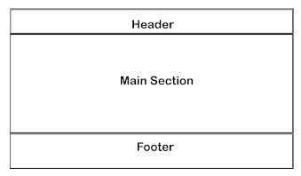
This guide will show you how to develop and design a simple professional one-page E-commerce Website that has three sections, header section, body section and footer section. If you are a beginner in the world of web design, you may see how we can help you set up a WordPress website for your company for free.
On this e-commerce website we shall create today, its head section will include its logo/name, navigation menu (navbar) and search icon. The body of it will have sliding images and product’s section where product images, title, price and information/details are shown.

So after reading this article, you will learn how to add all the necessary features that E-commerce websites should have.
As introduced in the introduction above, we shall be using HTML, CSS, and JavaScript to get this website done.
Now, let’s get started.
HTML code for an e-commerce website header section
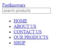
Every website has a header section which contains the navigation bar, brand name/logo, search bar, and menu items.
Here is an HTML code to create a header section of this e-commerce website which we want to create.
					<header>
    <a href="#">Fastknowers</a>
        <a href="">
            <input type="text" placeholder="search products" id="input" />
            <ion-icon name="search"></ion-icon>
        </a>
        <ul>
            <li><a href="#">HOME</a></li>
            <li><a href="#">ABOUT US</a></li>
            <li><a href="#">CONTACT US</a></li>
            <li><a href="#">OUR PRODUCTS</a></li>
            <li><a href="#">SHOP</a></li>
        </ul>
</header>
Here is the result of the HTML code above.
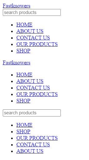
I want to make your e-commerce website a responsive one so that it should automatically adjusts for different screen sizes and viewports. If your website is responsive, people can easily comfortably use it on their phone (small screens) and PC (big-sized screens). That is to say that when we are using the website there is a problem that it is not able to show all the menu lists on the navbar. Finally, we decided to make a button-operated menu list. Below is a responsive HTML code for header section that displays icon so that when people click on the menu icon, it will open into a menu list which they can navigate.
					<header>
    <a href="#">Fastknowers</a>
        <a href=""><ion-icon name="close"></ion-icon></a>
        <ul>
            <li><a href="#">HOME</a></li>
            <li><a href="#">ABOUT US</a></li>
            <li><a href="#">CONTACT US</a></li>
            <li><a href="#">OUR PRODUCTS</a></li>
            <li><a href="#">SHOP</a></li>
        </ul>
        <a href="">
            <input type="text" placeholder="search products" id="input" />
            <ion-icon name="search"></ion-icon>
        </a>
        <ul>
            <li><a href="#">HOME</a></li>
            <li><a href="#">SHOP</a></li>
            <li><a href="#">OUR PRODUCTS</a></li>
            <li><a href="#">CONTACT US</a></li>
            <li><a href="#">ABOUT US</a></li>
        </ul>
    <ion-icon name="menu"></ion-icon>
</header>
Here is the result of a responsive header section created using pure HTML code.
Styling header section using CSS code snippets
CSS code snippets below to style website logo/name (FastknowersShop) and search icon and its icon.
					/* Resetting margins, padding, and box-sizing for all elements */
* {
  margin: 0;
  padding: 0;
  box-sizing: border-box;
}
/* Styles for the header element */
header {
  display: flex;
  justify-content: space-evenly;
  align-items: center;
  height: 60px;
  width: 100%;
  background: green;
}
/* Styles for the unordered list inside the header */
.heading ul {
  display: flex;
}
/* Styles for the logo anchor element */
.logo a {
  color: white;
  transition-duration: 1s;
  font-weight: 800;
}
/* Hover effect for the logo anchor element */
.logo a:hover {
  color: rgb(240, 197, 6);
  transition-duration: 1s;
}
/* Styles for list items inside the header */
.heading ul li {
  list-style: none;
}
/* Styles for anchor elements inside list items */
.heading ul li a {
  margin: 5px;
  text-decoration: none;
  color: black;
  font-weight: 500;
  position: relative;
  color: white;
  margin: 2px 14px;
  font-size: 18px;
  transition-duration: 1s;
}
/* Styles for anchor elements when they are active (clicked) */
.heading ul li a:active {
  color: red;
}
/* Hover effect for anchor elements */
.heading ul li a:hover {
  color: rgb(243, 168, 7);
  transition-duration: 1s;
}
/* Pseudo-element (::before) to create a horizontal line before anchor elements */
.heading ul li a::before {
  content: "";
  height: 2px;
  width: 0px;
  position: absolute;
  left: 0;
  bottom: 0;
  background-color: white;
  transition-duration: 1s;
}
/* Animation for the horizontal line on anchor hover */
.heading ul li a:hover::before {
  width: 100%;
  transition-duration: 1s;
  background-color: rgb(243, 168, 7);
}
/* Styles for the input element with id 'input' */
#input {
  height: 30px;
  width: 300px;
  text-decoration: none;
  border: 0px;
  padding: 5px;
}
/* Additional styles for the logo anchor element */
.logo a {
  color: white;
  font-size: 35px;
  font-weight: 500;
  text-decoration: none;
}
/* Styles for ion-icon elements */
ion-icon {
  width: 30px;
  height: 30px;
  background-color: white;
  color: black;
}
/* Hover effect for ion-icon elements */
ion-icon:hover {
  cursor: pointer;
}
/* Styles for anchor elements inside the 'search' class */
.search a {
  display: flex;
}
/* Positioning styles for ion-icon elements inside header anchors */
header a ion-icon {
  position: relative;
  right: 3px;
}
The CSS code styles this website menu and its items. I added comments to every section of it for you to understand it easily.
This navigation menu is responsive due to the double header sections we created in HTML earlier. Thankfully, let’s style it more with the CSS code below.
					/* This class controls the visibility of the menu */
.menu {
  visibility: hidden;
}
/* This style applies to a specific interaction with the 'ham' element inside 'heading1' */
.heading1 .ham:active {
  color: red;
}
/* This class manages overflow behavior for items */
.items {
  overflow: hidden;
}
/* These styles set the cursor to a pointer for 'ham' and 'close' elements */
.ham,
.close {
  cursor: pointer;
}
/* Media query for screens with a max-width of 1250px */
@media screen and (max-width: 1250px) {
  /* Hide list items inside 'heading' */
  .heading ul li {
    display: none;
  }
  /* Scale down the size of '.items' */
  .items {
    transform: scale(0.9);
  }
  /* Adjust the dimensions of images inside '.img-slider' */
  .img-slider img {
    height: 60vw;
    width: 80vw;
  }
  /* Change text color to red when '.ham' is active */
  .ham:active {
    color: red;
  }
  /* Display the menu as a column layout */
  .menu {
    display: flex;
    flex-direction: column;
    align-items: center;
  }
  /* Position '.menu a ion-icon' elements absolutely */
  .menu a ion-icon {
    position: absolute;
  }
  /* Keyframes animation 'slide1' for sliding elements */
  @keyframes slide1 {
    /* Keyframe percentages and 'left' positions */
  }
  /* Styles for the menu list */
  .menu ul {
    display: flex;
    flex-direction: column;
    position: absolute;
    width: 100vw;
    height: 100vh;
    background-color: red;
    left: 0;
    top: 0;
    z-index: 11;
    align-items: center;
    justify-content: center;
    opacity: 1;
  }
  /* Styles for the 'close' element */
  .close {
    z-index: 34;
    color: white;
    background-color: black;
  }
  /* Change text color to red when 'close' is active */
  .close:active {
    color: red;
  }
  /* Styles for menu list items */
  .menu ul li {
    list-style: none;
    margin: 20px;
    border-top: 3px solid white;
    width: 80%;
    text-align: center;
    padding-top: 10px;
  }
  /* Styles for menu item links */
  .menu ul li a {
    text-decoration: none;
    padding-top: 10px;
    color: white;
    font-weight: 900;
  }
  /* Hover effect for menu item links */
  .menu ul li a:hover {
    color: rgb(240, 197, 6);
  }
From line 69 in the code below, menu item list background is set to e red. We are done with header section.
Now, let’s proceed to write HTML code for the next section which is main/body section.
Since it is an e-commerce website we are creating, main or body section is also divided into two portions; image-slider and product image, title, price and information.
HTML code for main/body section of a e-commerce website
First, let’s create an image slider. To do that, I will use the image tag to add images. Note that to make image slide on a website, you need to use JavaScript. Below is an HTML code for image slider first.
<section>
<!-- Start of section -->
<!-- Container for the section -->
<!-- Container for the image slider -->
<!-- Image 1 -->
<img decoding="async" src="https://images.pexels.com/photos/6347888/pexels-photo-6347888.jpeg?auto=compress&cs=tinysrgb&dpr=2&h=750&w=1260" alt="">
<!-- Image 2 -->
<img decoding="async" src="https://images.pexels.com/photos/3962294/pexels-photo-3962294.jpeg?auto=compress&cs=tinysrgb&dpr=2&h=750&w=1260" alt="">
<!-- Image 3 -->
<img decoding="async" src="https://images.pexels.com/photos/2292953/pexels-photo-2292953.jpeg?auto=compress&cs=tinysrgb&dpr=2&w=500" alt="">
<!-- Image 4 -->
<img decoding="async" src="https://images.pexels.com/photos/1229861/pexels-photo-1229861.jpeg?auto=compress&cs=tinysrgb&dpr=2&h=750&w=1260" alt="">
<!-- Image 5 -->
<img decoding="async" src="https://images.pexels.com/photos/1598505/pexels-photo-1598505.jpeg?auto=compress&cs=tinysrgb&dpr=2&h=750&w=1260" alt="">
<!-- End of section -->
</section>
Code to make images above slide is JavaScript and it is shown below.
Below is the result of sliding image which its code is written in HTML and JavaScript above.
https://fastknowers.com/wp-content/uploads/2023/09/image-slider.mp4
Now that we have just created a sliding images (image-sliders) in the main section, let’s creation other sub-section in it which is product image, title, price and product detail or information.
To create this section, here is the HTML code.
<img decoding="async"
src="https://images.pexels.com/photos/1464625/pexels-photo-1464625.jpeg?auto=compress&cs=tinysrgb&dpr=2&h=650&w=940"
alt=""
/>
SHOES
$5
Lorem ipsum dolor sit amet consectetur.
<img decoding="async"
src="https://images.pexels.com/photos/3649765/pexels-photo-3649765.jpeg?auto=compress&cs=tinysrgb&dpr=1&w=500"
alt=""
/>
MEN's T-SHIRT
$6.34
Lorem ipsum dolor sit.
<img decoding="async"
src="https://media.istockphoto.com/photos/folded-blue-jeans-on-a-white-background-modern-casual-clothing-flat-picture-id1281304280"
alt=""
/>
JEANS
$9
Lorem ipsum dolor sit amet.
<img decoding="async"
src="https://images.pexels.com/photos/8839887/pexels-photo-8839887.jpeg?auto=compress&cs=tinysrgb&dpr=2&h=650&w=940"
alt=""
/>
WATCH
$9.1
Lorem ipsum dolor sit.
<img decoding="async"
src="https://images.pexels.com/photos/6858618/pexels-photo-6858618.jpeg?auto=compress&cs=tinysrgb&dpr=2&h=650&w=940"
alt=""
/>
SMART PHONE
$20
Lorem ipsum dolor sit.
<img decoding="async"
src="https://images.pexels.com/photos/5552789/pexels-photo-5552789.jpeg?auto=compress&cs=tinysrgb&dpr=2&h=650&w=940"
alt=""
/>
TELEVISION
$18
Lorem ipsum dolor sit amet consectetur.
<img decoding="async"
src="https://images.pexels.com/photos/4295985/pexels-photo-4295985.jpeg?auto=compress&cs=tinysrgb&dpr=1&w=500"
alt=""
/>
HOODIES
$6.7
Lorem ipsum dolor sit.
<img decoding="async"
src="https://media.istockphoto.com/photos/vintage-plates-with-silver-teaspoons-picture-id184363070"
alt=""
/>
DINNER SET
$10
Lorem ipsum dolor sit amet consectetur adipisicing elit.
<img decoding="async"
src="https://images.pexels.com/photos/6463348/pexels-photo-6463348.jpeg?auto=compress&cs=tinysrgb&dpr=1&w=500"
alt=""
/>
BLANKETS
$9.9
Lorem ipsum dolor sit amet consectetur adipisicing.
<img decoding="async"
src="https://images.pexels.com/photos/2659939/pexels-photo-2659939.jpeg?auto=compress&cs=tinysrgb&dpr=1&w=500"
alt=""
/>
LAPTOP
$99
Lorem ipsum dolor sit amet consectetur, adipisicing
elit.
<img decoding="async"
src="https://media.istockphoto.com/photos/modern-kitchen-microwave-oven-picture-id1144960519"
alt=""
/>
MICROWAVE
$30
Lorem ipsum dolor sit amet consectetur, adipisicing
elit.
<img decoding="async"
src="https://media.istockphoto.com/photos/black-coffee-maker-with-green-led-lights-picture-id177395430"
alt=""
/>
COFFEE MAKER
$29.7
Lorem ipsum dolor sit amet consectetur, adipisicing
elit.
<img decoding="async"
src="https://images.pexels.com/photos/6606354/pexels-photo-6606354.jpeg?auto=compress&cs=tinysrgb&dpr=1&w=500"
alt=""
/>
BED
$100
Lorem ipsum dolor sit amet consectetur, adipisicing
elit.
<img decoding="async"
src="https://media.istockphoto.com/photos/woman-turning-on-air-conditioner-picture-id1325708905"
alt=""
/>
AIR CONDITIONER
$78
Lorem ipsum dolor sit amet consectetur, adipisicing
elit.
<img decoding="async"
src="https://images.pexels.com/photos/5834/nature-grass-leaf-green.jpg?auto=compress&cs=tinysrgb&dpr=2&h=650&w=940"
alt=""
/>
BOOK
$9
Lorem ipsum dolor sit amet consectetur, adipisicing
elit.
<img decoding="async"
src="https://images.pexels.com/photos/4339598/pexels-photo-4339598.jpeg?auto=compress&cs=tinysrgb&dpr=2&h=650&w=940"
alt=""
/>
BAG
$36.5
Lorem ipsum dolor sit amet consectetur, adipisicing
elit.
<img decoding="async"
src="https://media.istockphoto.com/photos/hand-of-a-lady-selecting-yellow-colored-saree-in-a-shop-picture-id1301740530"
alt=""
/>
SAREES
$25.6
Lorem ipsum dolor sit amet consectetur, adipisicing
elit.
<img decoding="async"
src="https://images.pexels.com/photos/5816934/pexels-photo-5816934.jpeg?auto=compress&cs=tinysrgb&dpr=2&h=650&w=940"
alt=""
/>
WASHING MACHINE
$56
Lorem ipsum dolor sit amet consectetur, adipisicing
elit.
</section>
I advice you to copy it so that you add CSS codes below to make an amazing responsive products section for your e-commerce website. I am sure you will love it.
I won’t show the result of an HTML above because it is not good at all to view. But, when I have style it with CSS, it will turn a nice looking web page.
I gave an Image (product image) a border with a solid green color. It shrinks out when a mouse is hovered over it.
Product titles are backgrounded in a green color while their texts is in white color.
Products colors are green and product descriptions are given a black color so that they can appear sharp on a white background color. Here is a CSS code.
					.section2 .container {
  display: flex;
  width: 100%;
  height: max-content;
  flex-wrap: wrap;
  justify-content: center;
  margin: 10px auto;
}
.section2 .container .items {
  margin: 10px;
  width: 200px;
  height: 300px;
  background-color: white;
  border: 2.5px solid green;
  border-radius: 12px;
}
.section2 .container .items .name {
  text-align: center;
  background-color: #196801;
  height: 25px;
  padding-top: 4px;
  color: white;
  margin: 0;
}
.section2 .container .items .price {
  float: left;
  padding-left: 10px;
  display: block;
  width: 100%;
  color: #196801;
  font-weight: 650;
}
.section2 .container .items .info {
  padding-left: 10px;
  color: #00000;
}
.section2 .container .items .img img {
  width: 200px;
  height: 200px;
  margin: 0;
  padding: 0;
  border-radius: 12px;
  transition-duration: 0.8s;
}
.section2 .container .items .img {
  overflow: hidden;
  margin: 0;
}
.section2 .container .items:hover .img img {
  transform: scale(1.2);
  transition-duration: 0.8s;
  border-radius: 12px;
}
Here is the result.
https://fastknowers.com/wp-content/uploads/2023/09/e-commerce-page.mp4
I hope we are now done with image-slider and product details which are located in main or body section. Now, let’s start the final section which is called footer.
Every type of website (not only e-commerce website) needs a footer. Website’s footer is the last section of it in which some details about website are presented. The languages for creating a footer is HTML and CSS. Now, let’s create a professional responsive footer section for your e-commerce website.
Code for creating a footer section on an e-commerce website
This website is an e-commerce. Hence, we are going to create a professional footer for it. Here is a footer we shall create.
I used 4 classes to create the footer above. The footers were classed as footer, footer1, footer2, and footer3. Now, let me show you how I did it. Footer class is for all the section in footer. Footer1 class is for website logo/name (FastknowersShop) where I used a Div tag to add social media texts. Here is a complete HTML code for the footer section above.
					<footer>
    <!-- Branding Section -->
        <h1><span class="ez-toc-section" id="FastknowersShop"></span>FastknowersShop<span class="ez-toc-section-end"></span></h1>
    <!-- Social Media Section -->
        Connect with us at
            <a href="#">Facebook</a>
            <a href="#"> Linkedin</a>
            <a href="#">Youtube</a>
            <a href="#">Instagram</a>
            <a href="#">Twitter</a>
    <!-- Navigation Sections -->
        <!-- Company Section -->
            Company
            Complaint
            Careers
            Affiliate Marketing
            Support
        <!-- Services Section -->
            Services
            Return
            Cash Back
            Affiliate Marketing
            Others
        <!-- Products Section -->
            Products
            Sell your Products
            Advertise
            Pricing
            Product Business
        <!-- Get Help Section -->
            Get Help
            Help Center
            Privacy Policy
            Terms
            Login
    <!-- Copyright Section -->
        Copyright ©
        <h4><span class="ez-toc-section" id="FastknowersShop-2"></span>FastknowersShop<span class="ez-toc-section-end"></span></h4>
        2020-2023
</footer>
Now, the short below below shows the full e-commerce website we have just coded using HTML, CSS and JavaScript.
Here is the result.
https://fastknowers.com/wp-content/uploads/2023/09/e-commerce-shop.mp4
Conclusion
Hope this article has helped you know how to code a complete e-commerce website with HTML, CSS and JavaScript. Using these codes will not only get an e-commerce for free but also get a fast loading website. You may also see our expert guide on how to use Div tag to style website with CSS code snippets.
If you know that this article has helped you know the HTML, CSS JavaScript code snippets to create an e-commerce website, then please subscribe to our YouTube channel for more updates or Fastknowers newsletter. You can also find me on Facebook.