
Are you a beginner website developer and looking for codes to create a header that scrolls and sticks after some scrolls on a website? In this article, I will show you how to do that using HTML, CSS, and JavaScript. Keep reading.
This article is meant for people who are good at website design with HTML, CSS, and JavaScript. However, if you have a basic experience with any of them, today, I will teach you everything about how to use it to create a sticky header on a website step-by-step. You may also see our expert guide on how to use Div tag to style with CSS.
As you know, HTML is a language used to structure a website page, CSS is for styling the page and JavaScript is for adding functions to the page’s elements. Thus, the use of JavaScript, to make the header section fixed at the sticky position while the user is scrolling. A sticky header helps users know the services of the website.
HTML code for a sticky header on a website
The header is typically the top section of a web page used for displaying the branding logo/name, site navigation, and important information on the website. The site navigation can link to the menu like “Services,” “About,” and “Contact”, etc. You may see our expert guide on how to add navigation menus on a WordPress website or blog.
You can’t create a sticky header on a website which has no content (blank). Thus, I will add some content containing images and text including headings on this page for us to use it as an example. It will have a sidebar images at the left which can link to related post or latest post or popular post (depending on the post ID that is chosen).
Here is an HTML code for a website header section.
					<header>
    <!-- The following  is used to style the header -->
        <!-- The main heading or title of the header -->
        <h1><span class="ez-toc-section" id="Welcome_to_sticky_header"></span>Welcome to sticky header<span class="ez-toc-section-end"></span></h1>
    <!-- The following  might be for layout purposes, but its function isn't clear -->
    <!-- The <nav> element defines the navigation section of the header -->
    <nav>
        <!-- This  likely represents the site's name or logo -->
        Fastknowers
        <!-- The following <ul> and <li> elements create a navigation menu -->
        <ul>
            <!-- Each <li> represents a navigation item with an anchor link -->
            <li><a href="/archive">Services</a></li>
            <li><a href="/events">About</a></li>
            <li><a href="/contact">Contact</a></li>
        <!-- The closing <ul> tag ends the navigation menu -->
        </ul>
    <!-- The closing </nav> tag ends the navigation section -->
    </nav>
</header>
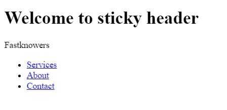
From the code above, it can be deduced that website header banner is ”Welcome to sticky header”, site title is ”Fastknowers” and the navigation menu are ”Services”, ”About”, and ”Contact”. I added comments for easy reference.
Without CSS, here is the result of the code above.
Using CSS and JavaScript, the header banner which was given a class of ”header-banner” above, will scroll with every content till the section of site title ”Fastknowers” before the header and navigation menu and items will become sticky to the top while scrolling.
Let’s add CSS code to the HTML code above for it to change.
					/* main */
header {
    height: 360px; /* Setting the height of the header */
    z-index: 10; /* Establishing a stacking context with z-index */
}
.header-banner header (Welcome to sticky header) {
    background-color: #333; /* Setting background color for the header banner */
    background-image: url('https://37.media.tumblr.com/8b4969985e84b2aa1ac8d3449475f1af/tumblr_n3iftvUesn1snvqtdo1_1280.jpg'); /* Adding a background image to the header banner */
    background-position: center; /* Centering the background image */
    background-repeat: no-repeat; /* Preventing background image repetition */
    background-size: cover; /* Scaling the background image to cover the container */
    width: 100%; /* Setting the width of the header banner to 100% */
    height: 300px; /* Setting the height of the header banner */
}
header h1 {
    background-color: rgba(18, 72, 120, 0.8); /* Adding a semi-transparent background to the header text */
    color: #fff; /* Setting the text color to white */
    padding: 0 1rem; /* Adding padding to the header text */
    position: absolute; /* Positioning the header text absolutely within the header */
    top: 2rem; /* Setting the top position of the header text */
    left: 2rem; /* Setting the left position of the header text */
}
.fixed-header {
    position: fixed; /* Fixing the header to the top of the viewport */
    top: 0; /* Aligning the fixed header to the top */
    left: 0; /* Aligning the fixed header to the left */
    width: 100%; /* Setting the width of the fixed header to 100% */
}
nav {
    width: 100%; /* Setting the width of the navigation bar to 100% */
    height: 60px; /* Setting the height of the navigation bar */
    background: #292f36; /* Setting the background color of the navigation bar */
    postion: fixed; /* Fixing the navigation bar to the top (typo: should be "position") */
    z-index: 10; /* Establishing a stacking context with z-index */
}
nav div {
    color: white; /* Setting the text color of the navigation title to white */
    font-size: 2rem; /* Setting the font size of the navigation title */
    line-height: 60px; /* Aligning the navigation title vertically */
    position: absolute; /* Positioning the navigation title absolutely within the navigation bar */
    top: 0; /* Aligning the navigation title to the top of the navigation bar */
    left: 2%; /* Setting the left position of the navigation title */
    visibility: hidden; /* Initially hiding the navigation title */
}
.visible-title {
    visibility: visible; /* Making the navigation title visible */
}
nav ul {
    list-style-type: none; /* Removing list bullets from the navigation links */
    margin: 0 2% auto 0; /* Setting margins for the navigation list */
    padding-left: 0; /* Removing left padding from the navigation list */
    text-align: right; /* Right-aligning the navigation links */
    max-width: 100%; /* Setting the maximum width of the navigation list */
}
nav ul li {
    display: inline-block; /* Displaying the navigation links as inline blocks */
    line-height: 60px; /* Aligning the navigation links vertically */
    margin-left: 10px; /* Adding left margin to separate the links */
}
nav ul li a {
    text-decoration: none; /* Removing underline from navigation links */
    color: #a9abae; /* Setting the color of navigation links */
}
Now that the CSS was being added, let’s see how it looks like. Note that I added an image (from Tumbl) as a background to the header banner. If you need more explanations about any section of codes above, please comment below in the comment section.

Preferably, you can add the code below in your CSS code snippets to help to ensure that different browsers render your page with consistent spacing and layout. Here is a code.
					/* resets */
body {
    margin: 0px; /* Resetting margin to 0 */
    padding: 0px; /* Resetting padding to 0 */
}
Last but the least, is adding a JavaScript to control the ”fixed-header” and ”visible-title” in the CSS code snippets above.
					/* ==========================================
scrollTop() >= 300
Should be equal the the height of the header
========================================== */
$(window).scroll(function(){
    if ($(window).scrollTop() >= 300) {
        $('nav').addClass('fixed-header');
        $('nav div').addClass('visible-title');
    }
    else {
        $('nav').removeClass('fixed-header');
        $('nav div').removeClass('visible-title');
    }
});
The JavaScript code snippets read as ”When the user has scrolled down by 300 pixels or more (equal to the height of the header), a class to the navigation bar for fixing it to the top of the viewport will be added”. And ”If the user scrolls back up, it removes these classes to return the navigation to its default state”.
Please remember to include jQuery before your JavaScript code in your HTML file. Hence, the HTML file that is using a CDN (Content Delivery Network) becomes:
					<!DOCTYPE html>
<html>
<head>
    <!-- Include jQuery from a CDN -->
</head>
<body>
    <!-- Your HTML content goes here -->
</body>
</html>
As earlier said, without content to enable scrolling, we can’t know whether the code above is working or not because it is just a one section we just designed (header section) to enable us to scroll for testing purpose.
The next section we shall create is called content section. And in it, we shall have four paragraphs, one image, and five paragraphs. At the right side bar of the webpage content (content section), there shall be three images which are linked to advert, recent post, popular post, etc.
HTML code for content section
Now, let’s begin to code the content section using HTML.
					<section>
<article>
<p><!--First paragraph --> Are you a beginner website developer and looking for codes to create a header that scrolls and sticks after some scrolls on a website? In this article, I will show you how to do that using HTML, CSS, and JavaScript. Keep reading.</p>
<p><!--Second paragraph -->This article is meant for people who are good at website design with HTML, CSS, and JavaScript. However, if you have a basic experience with any of them, today, I will teach you everything about how to use it to create a sticky heder on a website step-by-step.</p>
<p> <!--Third paragraph --> As you know, HTML is a language used to structure a website page, CSS is for styling the page and JavaScript is for adding functions to the page’s elements. Thus, the use of JavaScript, to make the header section fixed at the sticky position while the user is scrolling. A sticky header helps users know the services of the website.</p>
<p><!--Fourth paragraph -->The header is typically the top section of a web page used for displaying the branding logo/name, site navigation, and important information on the website. The site navigation can link to the menu like “Services,” “About,” and “Contact”, etc..</p>
<p> <!-- I took Image icon of 600X100 from placehold --> <img decoding="async" src="http://placehold.it/600x100"></p>
<p><!--First paragraph after image --> You can’t create a sticky header on a website which has no content (blank). Thus, I will add some content containing images and text including headings on this page for us to use it as an example. It will have a sidebar images at the left which can link to related post or latest post or popular post (depending on the post ID that is chosen).</p>
<p><!--Second paragraph after image -->From the code above, it can be deduced that website header banner is ”Welcome to sticky header”, site title is ”Fastknowers” and the navigation menu are ”Services”, ”About”, and ”Contact”. I added comments for easy reference.</p>
<p><!--Fourth paragraph after image -->Using CSS and JavaScript, the header banner which was given a class of ”header-banner” above, will scroll with every content till the section of site title ”Fastknowers” before the header and navigation menu and items will become sticky to the top while scrollin.</p>
<p><!--Fifth paragraph after image -->Using CSS and JavaScript, the header banner which was given a class of ”header-banner” above, will scroll with every content till the section of site title ”Fastknowers” before the header and navigation menu and items will become sticky to the top while scrolling.</p><!--End of article, now, let's add sidebar image -->
    </article>
<aside><!-- Beginning of three images at the left sidebar -->
<!--I placed a 100x100 image icon using placehold.it, please browse to know more about it. -->
<img decoding="async" src="http://placehold.it/100x100"><!--First image -->
<img decoding="async" src="http://placehold.it/100x100"><!--Second image -->
<img decoding="async" src="http://placehold.it/100x100"><!--Third image -->
</aside><!-- End of sidebar -->
</section><!-- End of body section -->
Here is result of combined HTML, CSS and JavaScript code snippets above.
https://s3.amazonaws.com/tempmedia.tumblr.com/7bf1cdaf32b760212b0710047a46aac2/a4cf4zze3m04s44ggg4008s80_tumblr_tmp.mp4Conclusion
Creating a header section that sticks when your website users are scrolling helps you present navigation option to them. As created above, we presented menu items to our services, about and contact us page. And we did it using HTML, CSS and JavaScript (jQuery). You may also see how to create a complete e-commerce website with CSS, HTML and JavaScript.
Hope this article has helped you know how to create a sticky header section on website using CSS, HTML and JavaScript (with the inclusion of jQuery). If yes, then please subscribe to my YouTube channel for more expert step-by-step guides. You can also find me on Facebook.