
Are you looking for how you can check the appearance of your blog or website on different devices? In this article, we have got you covered. If you want to know everything for free, then keep reading.
If a designer is working on your website, you have to test it or let your friends test it for you to ensure it appears perfectly on any device that people try to use it on. Nobody wants his website or blog to perfectly appears on one device and appears in a non perfect way on other devices, I am sure you too don’t want that, right? You may see our guide on how to design WordPress website using Elementor (free).
Unluckily, you and your friends can not have all devices in the world. On average one person can not have more than 5 devices including phones, laptops or desktops, and tablets or iPads, isn’t it? Comment below; how many devices do you have?
Here are some key statistics:
- Mobile Phones: 92.3% of internet users globally access the internet via mobile phones. Mobile devices generate around 57.9% of global web traffic with significant regional variations. In regions like Africa, mobile traffic accounts for up to 73.6% of the total web traffic.
- Laptops and Desktops: Laptops and desktops are used by 65.6% of internet users. They account for 40% of global web traffic, indicating that while mobile devices dominate, traditional computers still play a crucial role, especially in regions like Europe and North America.
- Tablets: Tablets are less common, with 27.3% of users accessing the internet via these devices, and they contribute to about 2% of total web traffic.
- Connected Devices: Other connected devices such as smart TVs, gaming consoles, and smart home devices contribute to a smaller portion of internet traffic. For example, connected televisions account for 31.9% of users, while smart home devices and gaming consoles have lower usage rates at 15.4% and 12.7%, respectively.
Smartphones are the primary access point for most users globally. However, laptops and desktops still maintain a significant presence, particularly in professional and educational settings. For more information about this statistics, visit Datareporter.com.
From the statics above, I hope that you can understand that you can’t have all different versions of devices. For you to view how your website appears on different devices, now what should you do? You will know how to do that in this article, keep reading.
How to check your blog appearance on different devices
Checking how your blog appears on different devices helps you to ensure that your website is responsive for user experience across desktops, tablets, and mobile devices.
Below are methods on how to check your blog appearance on different devices using one single device; using your desktop to check how your website looks on phone, iPads or tablets.
Method 1. Use responsive design tools in your browser
Do you know that there is a tool in your web browser (also known as DevTools) that can help you to check the responsiveness and other things that a website or blog you are on exhibits? Today, I will show you brief steps on how to use them in top web browsers.
1. Google Chrome DevTools
- Open your blog in Google Chrome.
- Right-click anywhere on the page and select “Inspect” or press
Ctrl+Shift+I(Windows) orCmd+Option+I(Mac). - Click on the “Toggle device toolbar” icon (or press
Ctrl+Shift+M). - A responsive design mode will open, allowing you to select different device presets like iPhone, iPad, or custom resolutions.
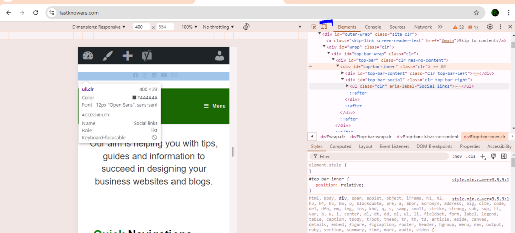
- You can also rotate the device, adjust the zoom level, and test different network conditions.
2. Firefox responsive design mode
- Open your blog in Firefox.
- Press
Ctrl+Shift+M(Windows) orCmd+Option+M(Mac) to enter Responsive Design Mode. - Select different devices from the drop-down list or enter custom dimensions.
- Test how your blog looks and behaves on various screen sizes.
3. Microsoft edge developer tools
- Open your blog in Microsoft Edge.
- Right-click and select “Inspect” or press
F12. - Click on the “Toggle device emulation” icon.
- Choose a device from the list or input custom dimensions.
Note that it’s important to check your blog or website’s appearance on different browsers like Chrome, Firefox, Safari, and Edge and adjust your design when neccesary. You may see our guide on tips to find the best company that develops websites in 2024.
Also test how your blog looks at different screen resolutions, especially common ones like 1024×768, 1366×768, 1920×1080, etc. to ensure your pages are properly appeared in screen sizes.You may contact us for a responsive web design services.
Method 2. Online tools and emulators
If the DevTools above seem not to help you to check the appearance of your website or blog on different devices, then these onlie tools and emulators below will definitely help.
1. Responsinator
This is a simple tool where you enter your blog’s URL, and it shows how it appears on various devices, including smartphones and tablets.
Visit Responsinator, enter your blog URL, and see how it looks on different devices.
2. BrowserStack
BrowserStack offers live testing on real devices. You can see exactly how your blog appears and behaves on various browsers and devices.
Visit BrowserStack and sign up for a free trial or use a paid plan for detailed testing.
3. Google mobile-friendly test
Google’s tool helps you determine if your blog is mobile-friendly and provides insights on how to improve it. Visit Google Mobile-Friendly Test, enter your blog URL, and run the test.
You may see our guide on how to clear cache of different browsers on Windows.
Method 3. Testing on real devices
You can equally use real devices to test your website or blog’s apperance on different browsers. This is the method I used when I did not know the methods I showed you in this article.
- Use your own devices: If you have access to different devices (smartphones, tablets, laptops, desktops), you can manually check your blog by opening it on each device.
- Ask friends and colleagues: If you don’t have access to many devices, ask friends and colleagues to check your blog on their devices and provide feedback for you.
Method 4. Use WordPress
- If you’re using WordPress, you can switch to preview to check how your blog or website appears on different devices directly from the WordPress dashboard.
- Use WPtouch plugin which is designed to create a mobile-friendly version of your WordPress site. You can preview how your blog looks on mobile directly from the plugin settings. You may see our guide on how to install plugins on the WordPress website.
Conclusion
I hope this guide has helped you know how you can check your blog appearace on different devices. You may also see our expert step-by-step guide on how to use Cloudflare for SSL certificate to protect your blog without buying SSL certificate.
If you know that this article has shown you how to check your blog appearance on different devices, then subscribe to my YouTube channel for more update. You can also find me on Facebook.


My website was built using WordPress. So anytime I am adding a post on my website, I use WordPress preview feature. It works wonderfully. I can use it to check my website view on phone, ipad and desktop from there.
Hi Amira
That’s great to hear! The WordPress preview feature is indeed very useful for ensuring your content looks great on all devices.
It is Responsinator I like to use most of the time. Using it is beginners friendly than built in inspector on chrome browser.
Yes Responsinator is good. Thank you for your feedback.
I enjoyed every every section in this guide. It’s being helpful. Thank you sir.
Glad you found it helpful, dear Dami Lola.